
2021-2023
Designing a dashboard that balances efficiency with accuracy in short collaborative iteration cycles
About the product
In conventional lending underwriting, reviewing bank statements is a time-consuming process for advisors, limiting their capacity to handle more applications and grow business revenue.
At first, Assess was a custom lending solution serving two New Zealand banks. Recognising the need for a more adaptable and scalable platform, we aimed to create Assess UK, a versatile dashboard tailored to UK lending, initially catering to small to medium enterprises. By designing and building this product:
My responsibilities
As the only designer of the product team, and one of five designers of the company, I oversaw the end-to-end design roadmap of the product. My responsibilities included:
Leading the research and design of the product
Designing UX/UI through prototypes, wireframes, Figma high fidelity designs
Co-planning and leading product roadmap with Product manager of the team
Facilitating product workshops between teams to co-design products down to the technical details to discuss features and the action plan of each iteration
Designing and leading the development of the company’s design system
Financial advisors analyse customer spending to identify potential unhealthy patterns and areas for improvement to ultimately understand the customer's affordability. Some companies such as TSB offer debt advice, others such as TransUnion banking partners offer a range of loans. Traditionally, advisors would spend a lot of time checking each transaction, understanding what payments are made for and calculating spending coefficients to assess against their company's policy. This is extremely time consuming, and open banking means banks can now share customer transactions digitally. Machine learning categorises transactions into buckets, which can give a quick snapshot to advisors. The trick was knowing what buckets and insights to show to avoid creating biases, excluding edge case customers or simply misjudging potential profiles.
What problem are we really solving?
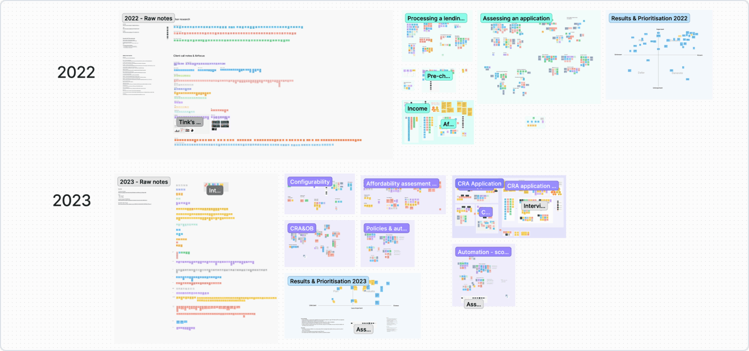
I began by collecting sales call scripts and conducting user interviews to delve into industry and user requirements with a range of lenders. Throughout my 1.5 years on the project, I've continuously curated a dynamic Research board of insights from client and external participant interviews. As we found out, our primary challenge was that the dashboard wasn’t presenting crucial information essential for a complete assessments. Losing potential clients to other competitors spurred us to investigate the specific needs the product wasn't supplying.
After running affinity mapping and prioritisation workshops with the Product manager and occasionally other designers (to avoid interviewer bias) in which we would categorise feedback notes into themes, we found that advisors were looking for insights into a customer's monthly earnings, expenditures, debt obligations, and potential risky financial behaviours like frequent overdrafts and gambling.
How do we adapt a NZ financial product to UK needs?
I’ve started by replacing New Zealand specific financial markers with standard spending flags from the UK, focusing on essential spending as a key indicator of affordability. While users found spending categories helpful, they were most interested in specific financial behaviours like having debt collection relationships present on the account, excessive cash withdrawals, gambling activity, and past lending relationships.
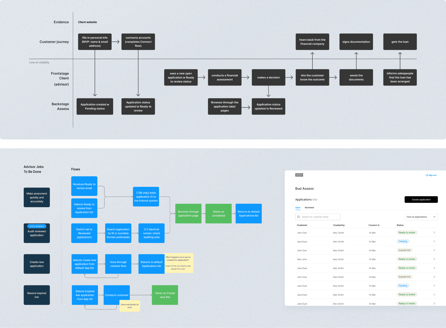
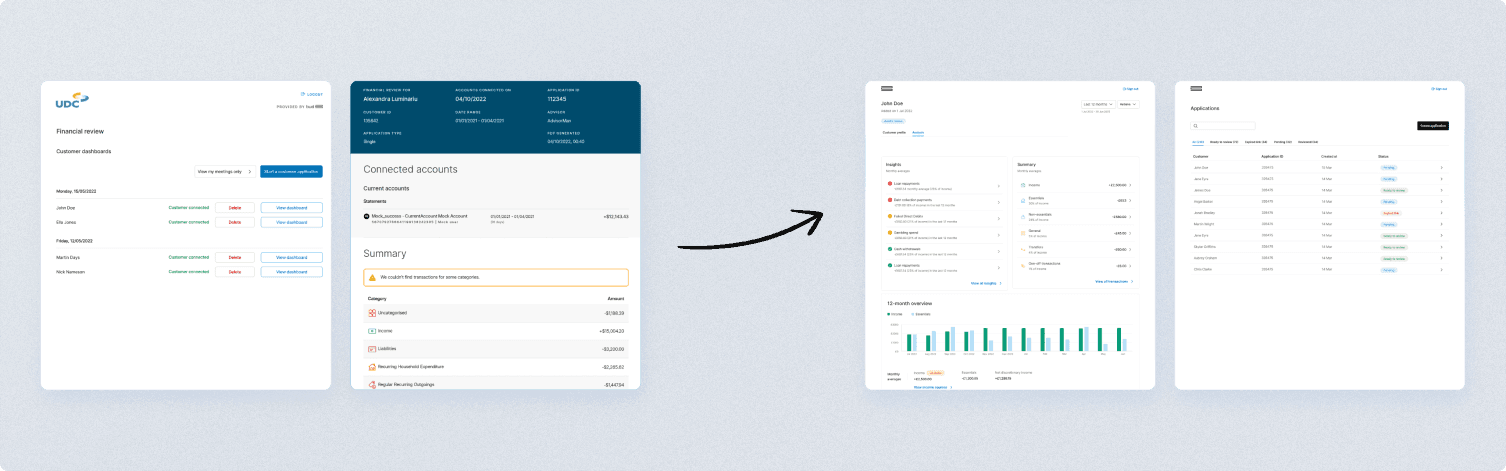
Recognising the significance of these indicators, I've explored flagging them early in the process to streamline assessments and make room for further evaluation. I’ve also redesigned the applications list page so advisors would know right away which applications are ready to be picked up and redid the status pipeline in collaboration with the Back End team to ensure the status conditions are more intuitive. Overall, the product now had a redesigned information architecture in line with the mental model of advisors, according to research.
How does we improve the design further?
During this phase I’d continue to work with the engineering team to assess feasibility and technical requirements or limitations. As usual, this is when edge cases and unwanted scenarios would be discussed to create a well-rounded product. They would be in the loop with wireframe and hi-fi prototype updates and we’d discuss any major changes. I’d then prioritise iterations based on user feedback from interview sessions to validate our assumptions and proposed solutions.
I’d follow with a quick round of user interviews to validate the designs before finalising the high definition ones. An unexpected finding I came across was that the two main tabs of the dashboard needed to be swapped because of the necessity of information from the initially less utilised tab for vetting applications.
Delivery
This was a project that spanned over 1.5 years: business priorities changed a lot, we had several product managers and team leads leave, meaning that sometimes it would be difficult to avoid context switching. I found that during these moments an honest and empathetic channel of communication is what helped understand different perspectives and make decisions as a group. I would frequently take over management responsibilities by communicating with higher-ups and the legal team about any new updates and discussing the product roadmap, as well as getting more involved in engineering conversations about the way we’re using our APIs to display the data needed by the designs. While this was at times stressful as it meant I had multiple responsibilities at once that weren’t limited to my product design role, I’ve discovered how a design-first approach maintains team alignment and fits the product roadmap to client expectations.
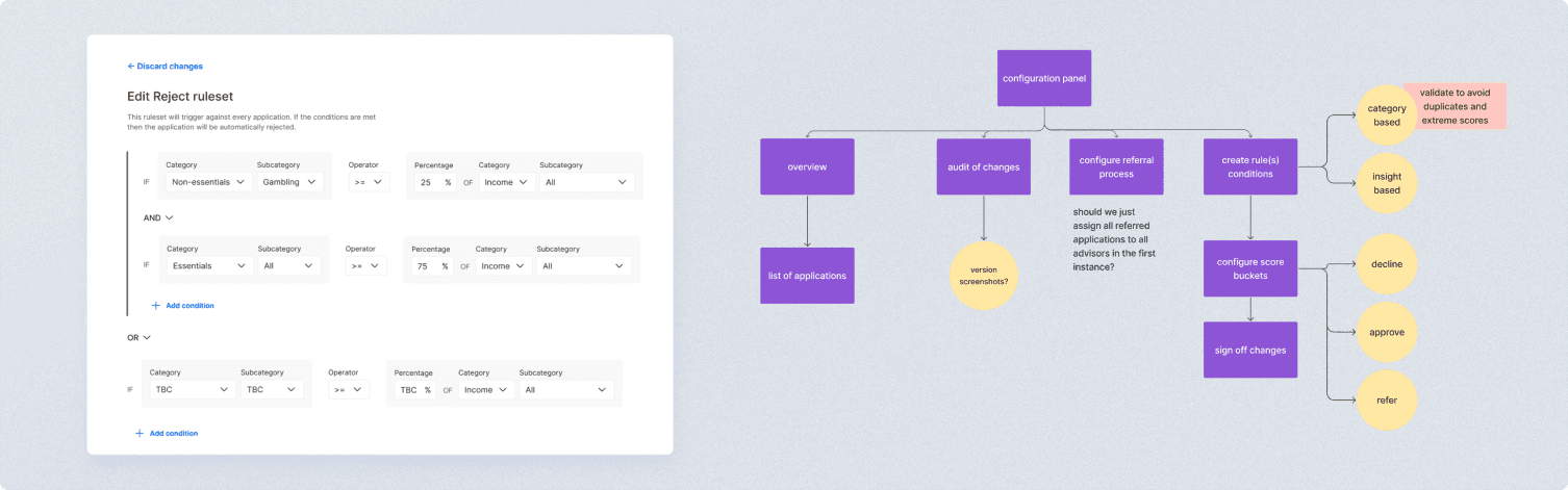
Interestingly, after most of the iterations were released, I have found that while users appreciated the improved speed of the dashboard, their ultimate preference would be for no assessment at all. This sparked an exploration into developing an automated tool that integrates company risk policies, providing instant Yes/No answers based on customer data input. After discussions with the team, I created a proof of concept for this automated product, which would be primarily managed by a Risk Manager, streamlining policy setting and monitoring. The original dashboard would remain accessible for auditing purposes, while the new tool would focus on policy management.
Business impact and results
We have serviced the debt advice and lending processes of TSB, TransUnion, TotallyMoney and many more companies, as one of the main lending platforms in the UK based on external feedback via sales team (team OKR)
We have decreased the application review time to 3-5 minutes (team OKR), allowing companies to review higher volumes of applications and increase acceptance rates (client OKR) while receiving increasingly positive feedback about the features we’ve released and the overall efficiency of our dashboard:
‘Clients reported a reduction in clients defaulting on loans, such as Moneyboat reporting a 20% reduction in missed payments using our solution’
‘Insights section is very useful, it serves as a snapshot of quick good/bad indicators of the customer’s financial behaviour’